How Can Graphic Design Aid Social Distancing?
Unity is integral to the human experience. We connect to play, study, shop, worship and work. This is evident throughout history as we naturally gravitate to bustling public spaces such as museums, galleries, libraries, shopping centres and houses of worship.
We rely on signs and symbols in these spaces to relay key pieces of information. From cave paintings to hieroglyphics, from Isotype to the road signs of Jock Kinneir and Margaret Calvert, we grasp complex messages and warnings.
Organisations are now under duress caused by the COVID-19 crisis. They are looking for solutions to return to the world and their audience in a safe way. Now, more than ever, we must employ clear way-finding and information architecture to keep our public spaces safe. This architecture is formed of infographics, signage, maps, diagrams, books and websites. These vehicles are often both visually appealing whilst making information easier to digest.
With so many options available, how can graphic design best aid social distancing?
Floor Markings
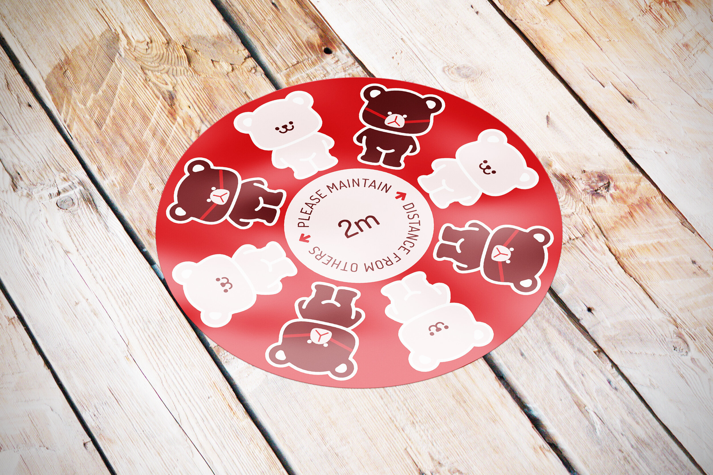
Your organisation can use floor markings to implement one-way systems and help people maintain social distancing. These enforcements and zoning may feel uncomfortable and restricting for customers. To make these instructions easier to digest, implement friendly and bold colour-schemes and visual cues.
Signage
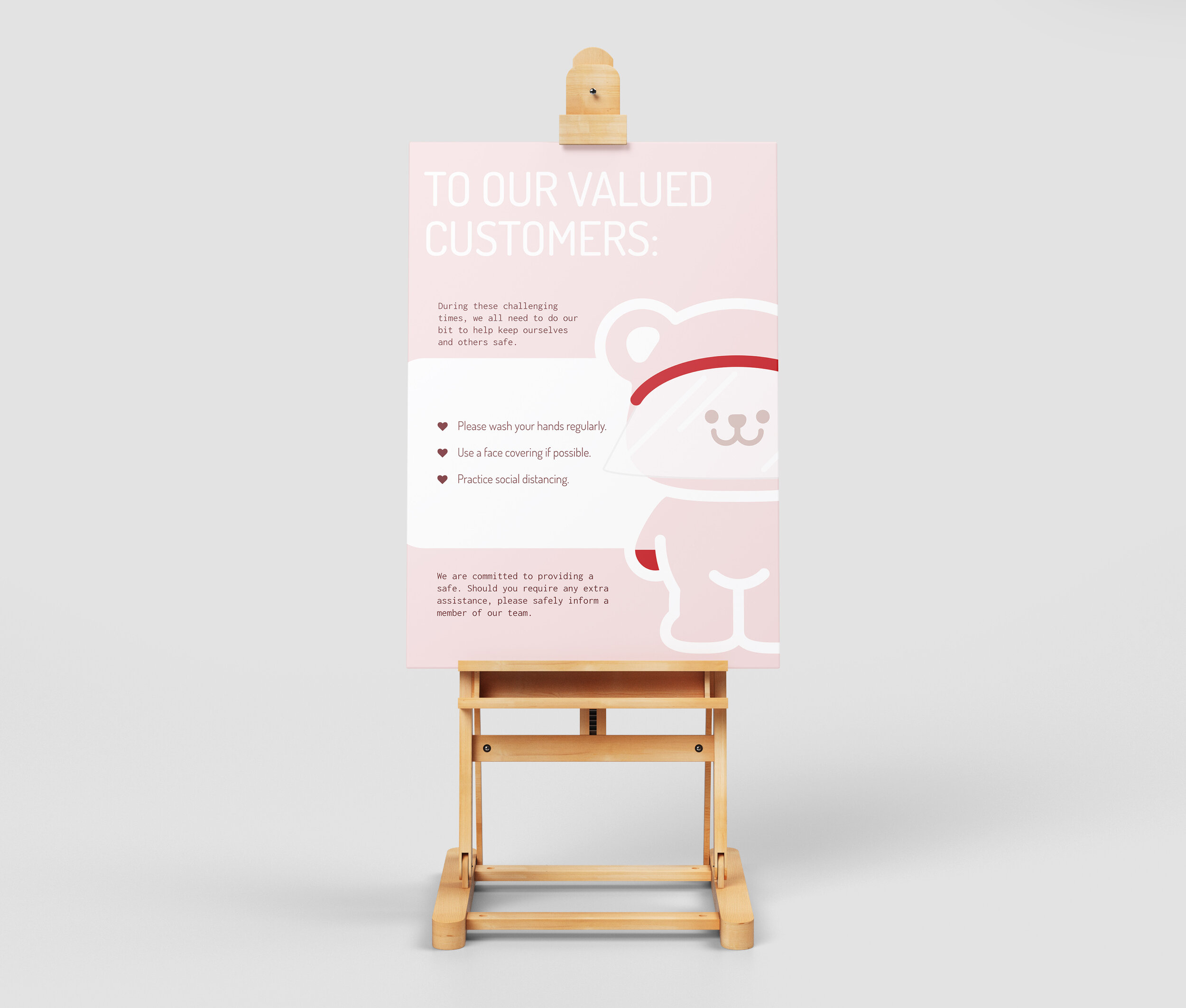
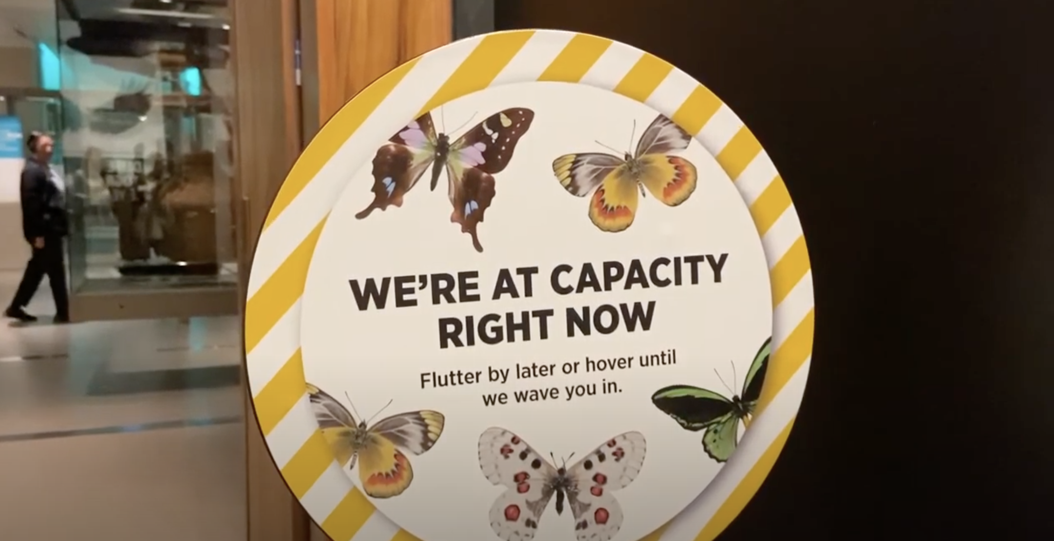
Signage has the power to communicate more information than stickers and floor-markings. The balance of copy and imagery can be determined by the positioning of the signage. Customers will have more time to read signage whilst waiting in queue systems but may only have seconds to grasp the message whilst on-the-move. Use clever copy-writing and diagrams to manage queues, entry and exit points and rights of way.
Organisations are using signage to express additional measures they’re taking during the crisis. It can be a vital tool in your brand arsenal so take the opportunity to show your customers how much you care and think of new campaigns to make their life easier.
Information Material
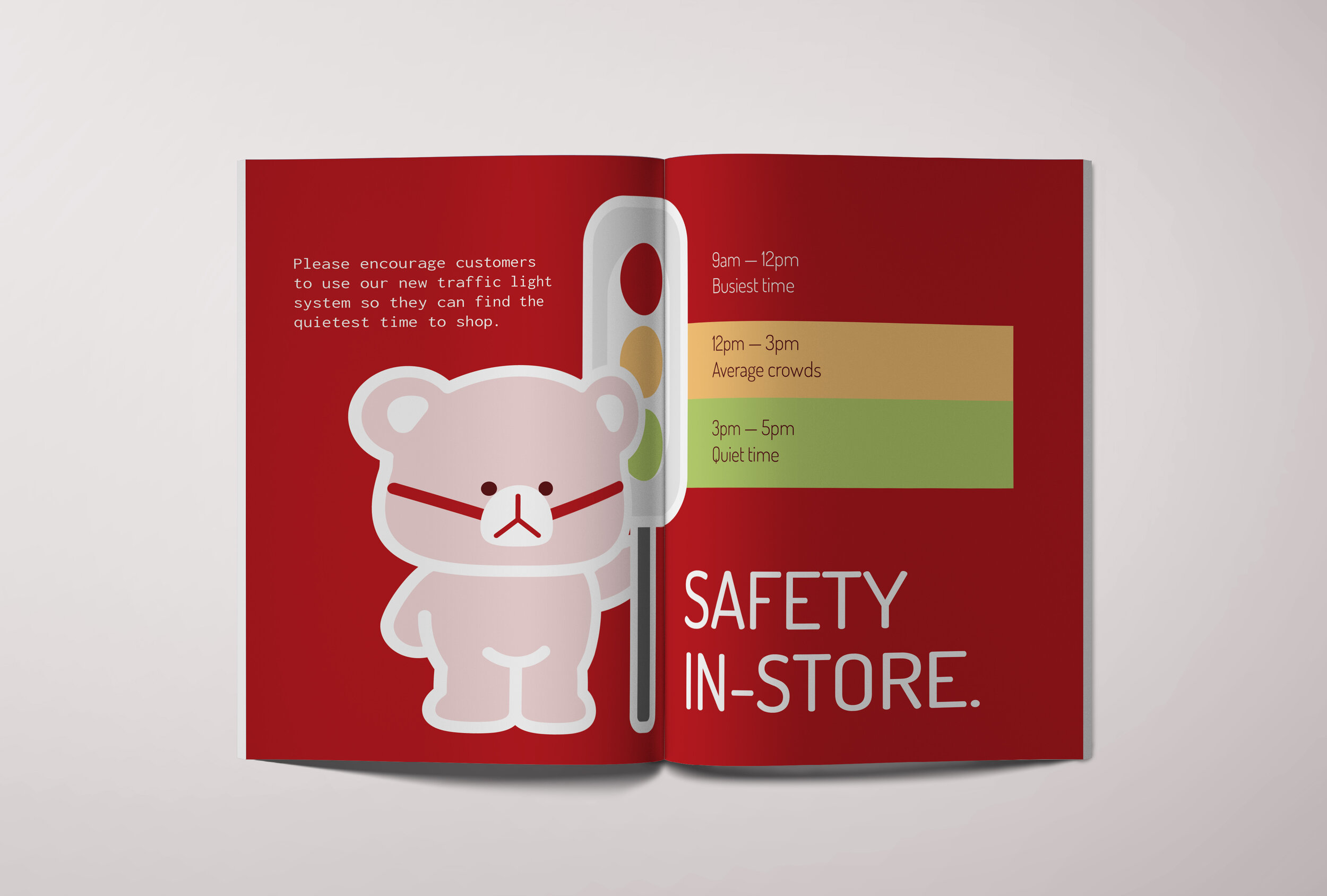
Need to explain and expand your plans whilst delivering extra value? Your organisation could design and produce internal training guides for teams. Not only must you set your customers with the right expectations, you must set the right expectations internally. This nurtures a sense of purpose and community, which then motivates them.
Case Study: Auckland War Memorial Museum
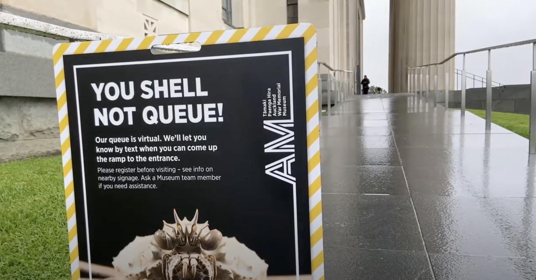
Auckland have unlocked their major attractions after lengthy closures. Their War Memorial Museum introduced one-way systems, social distancing, no-touch exhibits, and a virtual queue system for capacity management plus contact tracing,
Virtual queue systems are no new phenomenon and we experienced the process in Hong Kong. At Hong Kong Cultural Centre, we downloaded a virtual ticket and waited for our allocated visit time. We felt this contributed to an overall more pleasurable experience.
Along with this contact tracing, Auckland War Memorial Museum have introduced clearer visitor way-finding, and one way systems. Stickers and posters are in place to guide a safe path around the parts of the Museum that are open.
Furthermore, the Museum have temporarily closed their interactive exhibits as a precaution. Stickers have been placed over the ‘touch-zones’ to prevent visitors touching.
We hope you enjoyed learning more about graphic design’s role in social distancing. Is your organisation implementing new signage, guides or stickers?
If you’d like to stay in touch with Buttercrumble and keep up-to-date with our news and resources, then please join the Buttercrumble grapevine below.

