Pivoting a beauty brand for the better
The brief
Project aim: Beauty Kin – the parent brand – was dominated and restricted by its hero product “Wing It”, eyeliner guides. We aimed to relaunch as an ethical lifestyle brand with an exciting beauty product line of body and face bars.
Project objectives:
Develop Beauty Kin’s brand offering to enable business growth.
Act as brand guardians and creative directors to ensure the strategy is realised in visual forms (e.g. photography and e-commerce)
Design retail-ready packaging with customers and buyers in mind.
Impact
Launched 5+ new products
The rebrand enabled Beauty Kin to launch 5 new products. This wasn’t possible under the original, restrictive brand.
5* Customer reviews
“The soaps all arrived beautifully packaged” – such glowing words about the design (and products alike)!
Entered new audience segments
The new brand identity is inclusive and appeals to both women and men of different ages.


Pivot and discovery
Buttercrumble rebranded Wing It as Beauty Kin to enable product diversification. This included: brand strategy, visual identity design, art direction, and packaging design. The new branding and packaging have helped Beauty Kin to launch 5 new products (and counting)!
Buttercrumble worked closely with Beauty Kin and their customer research to define the new direction for the brand. This insight informed the new brand strategy which included purpose, community profiling, tone of voice, marketing messaging, and guiding principles.


Establishing a visual style
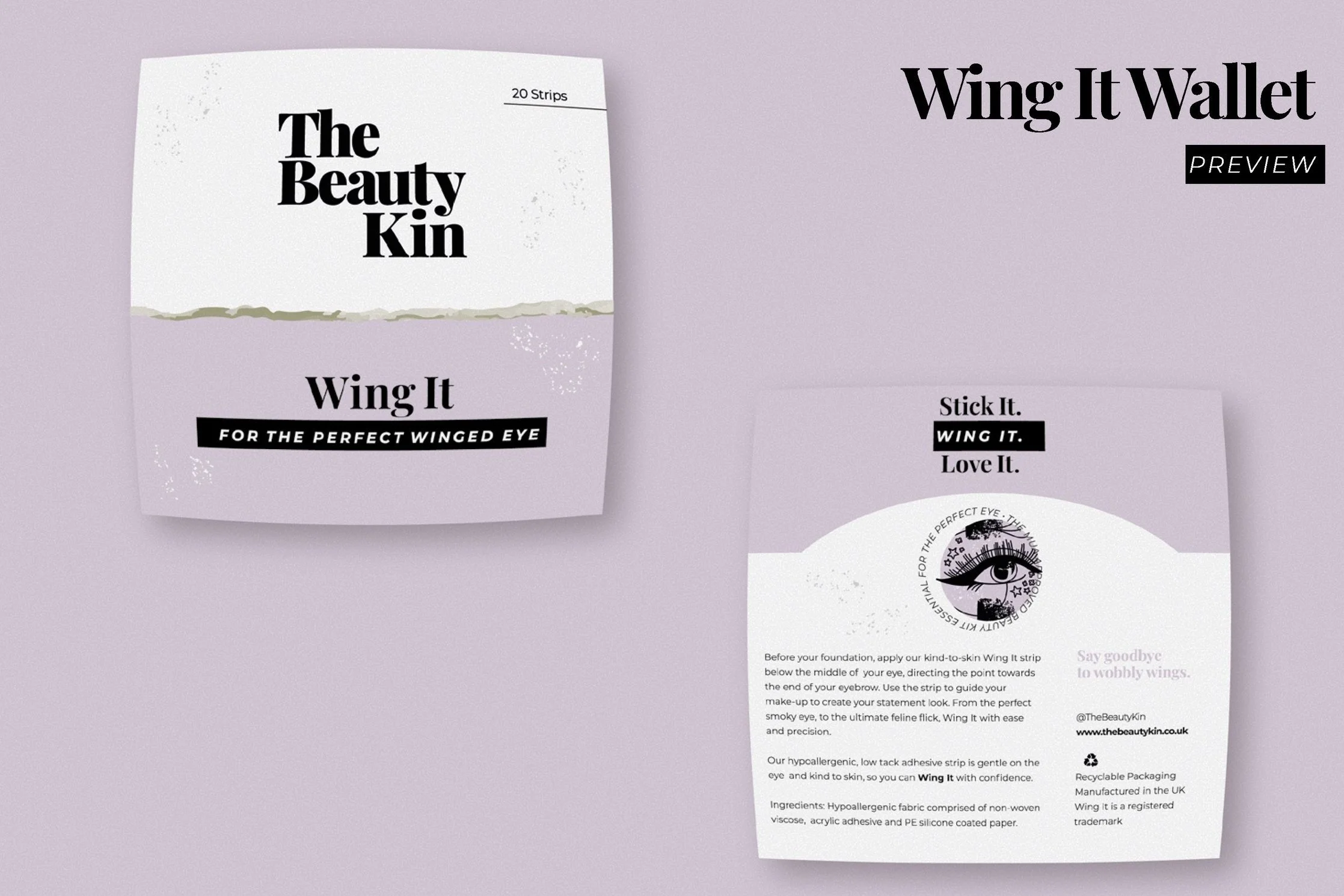
We designed a visual identity consisting of a logo suite, colour palette, typeface pairing, and suite of spot illustrations.
The logo utilises a stylish serif font. This approach is modernised by the use of upper-case and closely set type. The contrasting alignment of the first and last line creates energy.
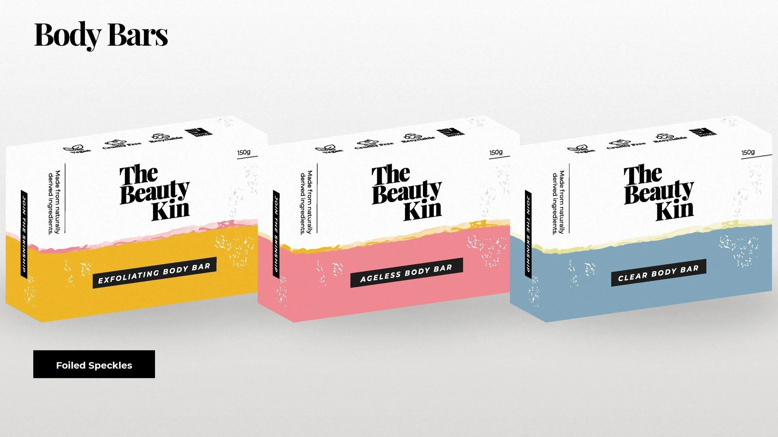
We created two colour palettes for full flexibility. The first colour palette provides a harmonious backdrop for all brand messages. The monochromatic scheme allows new products to be introduced in an array of colours. One to three secondary colours can be used from the secondary colour scheme so each independent colour could represent a different product.

Spot illustrations


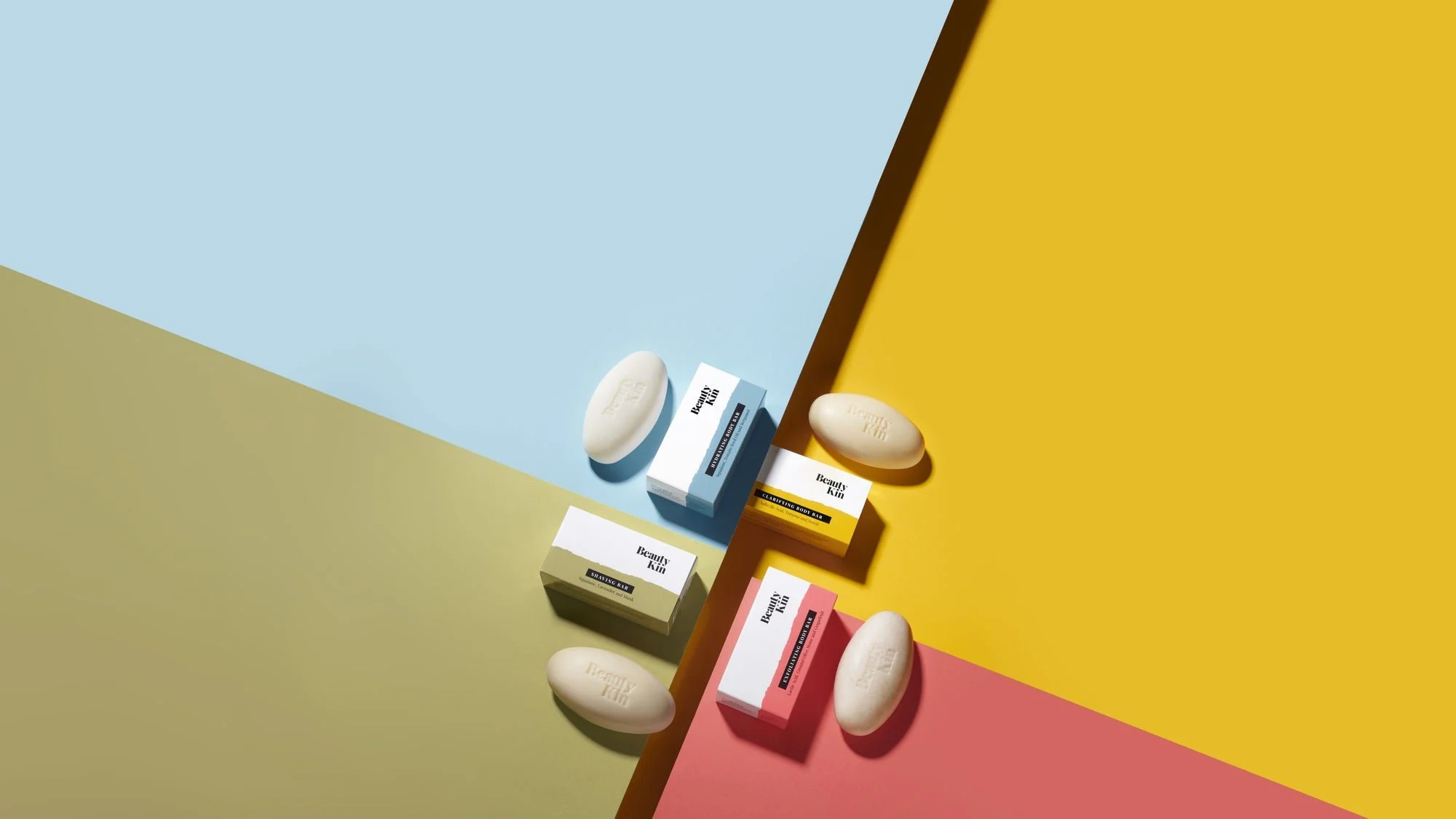
Packaging design
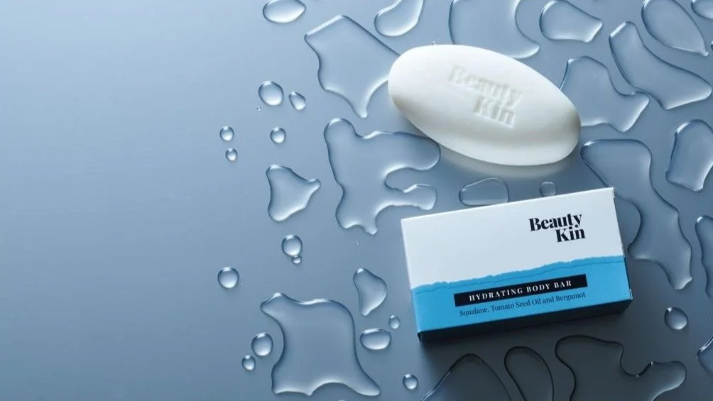
The new packaging stands out in a saturated marketplace and has helped the brand to generate positive 5* reviews on their website.
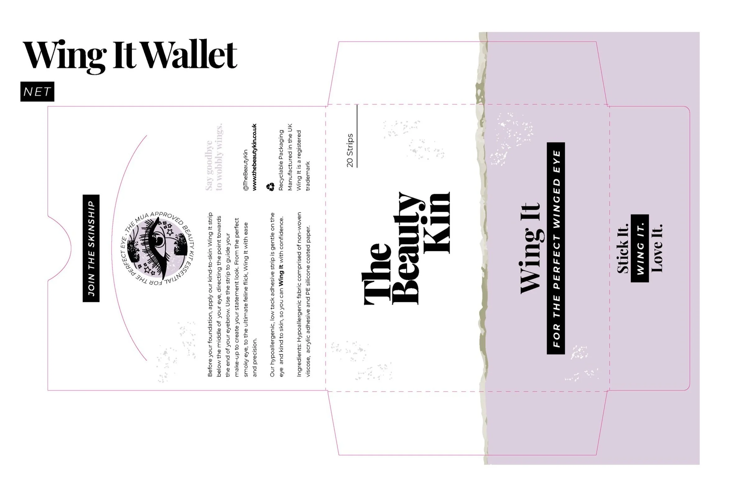
We recommended different print finishes and sustainable stocks so the packaging aligned with the brand’s ethos. Digital prototypes were created, allowing for full design exploration, before manufacturing! This is essential to reduce cost and risk for both the brand and manufacturer.
We supported Beauty Kin from design to final output, providing full cutter designs, so we could guarantee success.
Creative direction
Buttercrumble act as Beauty Kin’s brand guardians to ensure the quality of the brand is retained. This included us briefing product photographers and website developers through comprehensive style and inspiration documents.
For instance, Beauty Kin’s photography needs to communicate honest skincare. The kin is supporting and inclusive. After all, they exist to listen to beauty frustrations and turn them into feel‑great skin inspiration.
Therefore, imagery should feel unpretentious, but confident. Beauty Kin are fearless in our active pursuit for skincare equality.


The results
We are excited to see the brand go from strength to strength. We will continue to provide reserved capacity, dedicated support, and innovative insights as brand guardians.
Our designs helped the Beauty Kin press team to secure these impressive statistics:


