Rebranding a local cultural education partnership (LCEP)
The brief
Project aim:
Rebrand Leeds' LCEP, giving it a distinct identity and clearer messaging. For example, the previous LCEP webpage was part of another organisation’s platform, creating confusion. The rebranding supports LCEPs mission to improve visibility of local cultural offerings.
Objectives:
Engage meaningfully with stakeholders (local young people and the LCEP board members).
Co-design a visual identity to be easily implemented by internal teams.
Design and build an informative website using Wordpress to grow awareness.
Created valuable IP
…By establishing a unique brand (including a new name) and standalone digital presence.
Fostered stakeholder ownership
…Through co-design workshops, feedback sessions, and a collaborative design process.
Impact
Brand guidelines
Co-creating a new name
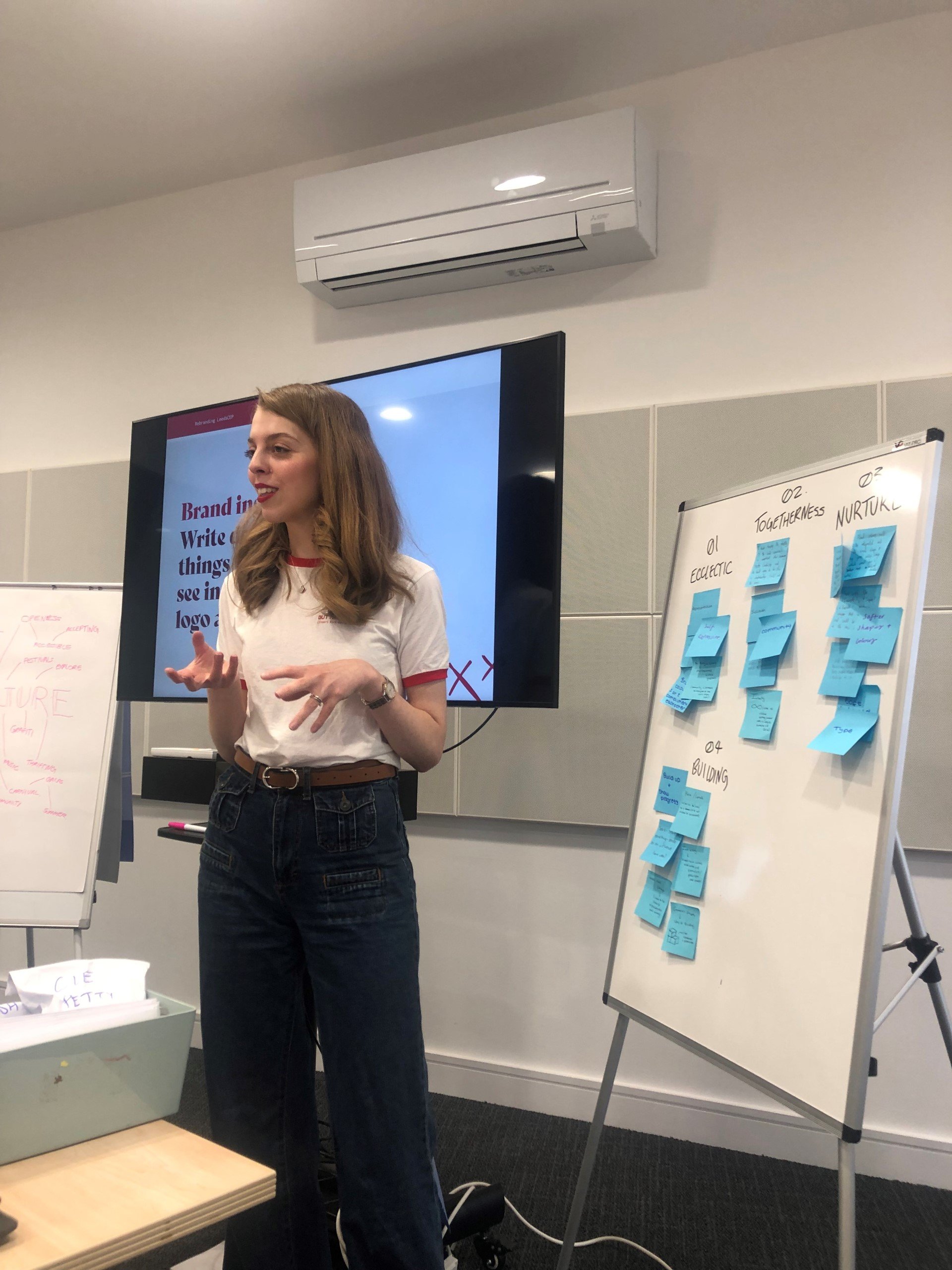
We rebranded Leeds LCEP to Leeds33. We co-created the brand name and visual identity by hosting a co-creation workshop with local young people to better understand their needs and motivations. Together, we generated a range of name ideas and then internally evaluated ideas based on availability, potential difficulties, ease of adoption, brand fit, and likely impact.
Visual identity
This design was informed by local young people and inspired by the power of fractals. Culture and creative partnerships in the city branch out, generating new development pathways, to enrich the local communities of Leeds.
The logo design depicts the 33 wards of the city through a geometric map. The map is formed through connecting triangles as the 3 sides represent culture, education, and partnership.
Accessible design
We developed an accessible, colour blind-friendly palette for Leeds' LCEP, ensuring all users could engage effectively. By carefully selecting colours that provide strong contrast, we created a palette that works across digital and printed materials. We also provided guidance on maintaining sufficient contrast when designing future collateral to ensure accessibility.
Website design
We implemented the new Leeds' LCEP brand through a custom-designed WordPress website, ensuring ease of use for the board. This platform allows them to independently update resources and event information, empowering the team with full access and control over content while maintaining the integrity of the new brand identity.
Boosted local engagement
…By building a user-friendly platform to advertise events, resources and trustee positions.
The results
We transformed a forgettable ‘Leeds LCEP’ into the exciting Leeds33. The design process empowered the Board who continue to benefit through an accessible website design and easy-to-use brand assets. This empowerment is crucial for a LCEP network because it allows the board to react swiftly to the needs of their community. The new website's structure and branding ensures Leeds33’s mission is more visible, and their networks are better equipped to engage with educators, cultural organisations, and young people, ensuring ongoing impact across Leeds.


